Overview
In this paper, we will explore how the VIANOPS platform helps data scientists monitor prediction drift using a taxicab fare prediction model as an example. The platform allows users to develop and deploy models with their existing ecosystem of preferred tools. Using data-driven metrics including Population Stability Index (PSI) and Jensen-Shannon divergence, teams gain a granular understanding of feature drift (model input), prediction drift (model output), and model performance trends.
VIANOPS provides a rich, interactive model dashboard for data scientists to quickly identify and track model performance, prediction traffic, and feature drift. Users can drill down to analyze and compare model performance and data drift over different periods of time and across different slices of data, or segments.
Introduction
Advancements in technology and changing consumer expectations have driven the taxicab industry to evolve. Ride-hailing services such as Uber and Lyft have disrupted traditional taxi companies by providing consumers with a convenient and cost-effective way to travel. To remain competitive, taxi companies have had to adapt by using data analytics and predictive modeling to optimize operations.
Prediction models are very useful, but when there are changes in data or the environment, they are subject to making suboptimal decisions. We’ll explore how the VIANOPS platform enables data scientists at a fictitious taxicab company keep their machine learning models trustworthy with access to the critical, real-time information they need about model performance, with the ability to quickly drill down to understand when performance dropped, identify what segments of the population were affected, investigate why it happened, and identify potential corrective action.
Overview of the Example
|
Data Set:
|
Structured, tabular data from the NYC Taxi and Limousine Commission (TLC.) |
| Model: | This example uses a regression model. |
| Segments: | The data science team created two segments to monitor model performance more closely in the most heavily trafficked areas of NYC. |
| Policies: | Policies are a set of rules that define a process to track drift, with thresholds to alert users when drift occurs. Multiple policies can be defined for each to monitor drift from multiple dimensions; this example uses four policies. |
| Features: | The model has tens of features. A subset of these features is used in this example, including estimated trip distance in miles, estimated trip time in minutes, and extra cost in dollars. |
In this example, we will use the following techniques to understand why performance dropped:
| • Explore changes in the value distribution of features | • Compare feature distributions over time |
| • Monitor changes in correlations between features | • Visualize changes in feature distribution |
| • Use feature drift to expose data quality issues | ∙• Use segments to uncover unique patterns |
Identify and explore a drop in model performance
The flexibility to analyze different time frames is particularly important when monitoring for drift. While one-timeone time configuration may show low level or slow/moderate increases in drift, another configuration may show drastic and untimely drift occurrences. By providing the flexibility to compare and monitor different time frames, our solution can identify and respond to drift more effectively, minimizing the risk of fraudulent transactions slipping through undetected, and thus leading to significant financial losses.
Eliminate Alert Fatigue
-
- severity
- type of risk
- policy
- data segments
An Alert Table goes a level deeper with links to policies and more info about each policy such as target/baselines and the metrics and value of alert thresholds reached. Models can have multiple policies to monitor drift across segments, features, and target/baseline timeframes.
Dig deeper to understand the drop in model performance
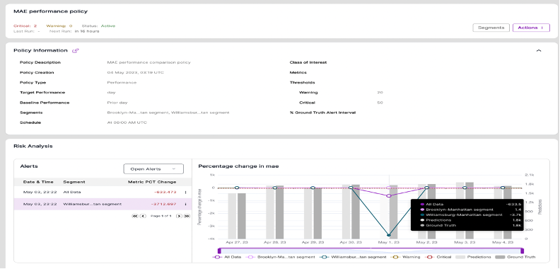
The MAE Performance policy was created to track model changes in model performance day-to-prior-day across three data segments: All Data, Brooklyn-Manhattan, and Williamsburg-Manhattan. VIANOPS makes it easy for users to evaluate performance for a whole data set, a single segment, as well as across multiple data segments at the same time, simply by clicking in the legend to add/remove data.
This helps uncover patterns or hotspots that would otherwise remain hidden or very difficult to detect when examining a large data set. In our taxicab example, overall model performance has dropped, but it’s clear that the performance dropped significantly only in one segment (the green line which represents Williamsburg-Manhattan), and remained fairly normal in the other two. This chart confirms a drop in performance on May 1 that continued for 3 days. (May 2 shows zero change from the prior day, when performance dropped.)
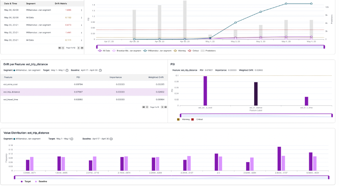
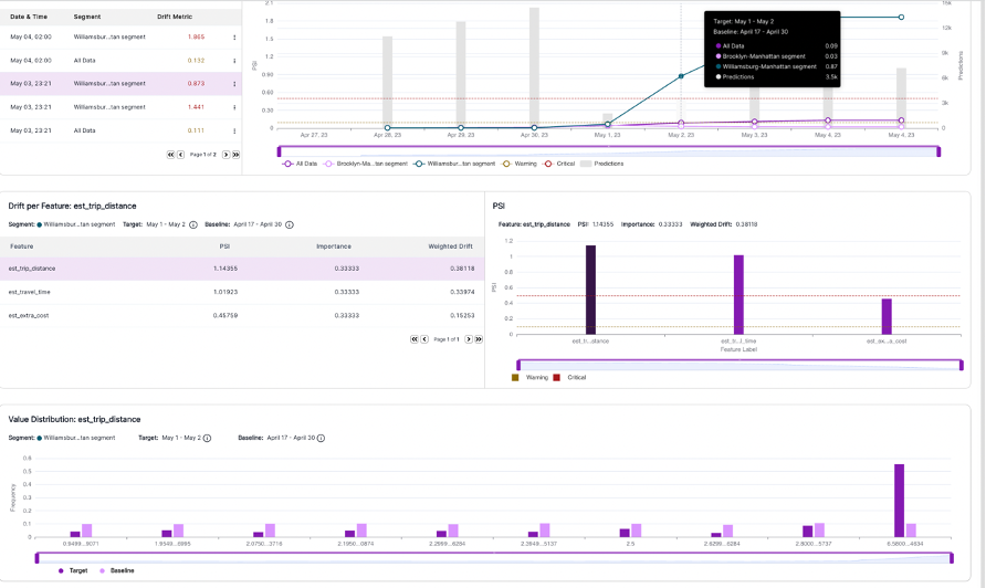
Explore value distribution of features to understand root cause
Conclusion
Using the VIANOPS platform, a data scientist, ML engineer or other stakeholder can quickly identify when model performance drops, explore the features across different segments of data to find out what is changing, and use the correlation between a change in feature drift and prediction drift to determine why the model’s performance changed.
The ability to explore and compare multiple features across different data segments over custom time periods drives efficiency and enables teams to uncover hotspots and other patterns that would otherwise be hidden. And, the ability to customize how teams look at data, such as in custom bins, makes it easier to expose patterns in the value distribution of features to better understand the impact of feature drift and whether it’s time to retrain the model.


