Quickstart
VIANOPS Free Trial
Welcome to the VIANOPS free trial
We hope you enjoy this tutorial as it walks you through our monitoring solution capabilities using an example model available in our free trial – a taxicab fare prediction model.
The tutorial showcases key capabilities of the VIANOPS platform that simplify the monitoring process and provide deep insight to understand feature drift, prediction drift, and model performance over custom defined periods of time, as compared with other features, and across different segments of data.
Please review both parts of this document to understand concepts, terminology and key platform capabilities.
Part 1 – Understanding the Terminology
Part 2 – Exploring Model Dashboard and Investigating Performance Drop
For additional information, please visit https://vianops.ai/ or check out our Docs – https://docs.vianops.ai
Part 1 Understanding the Terminology
| Baseline & Target Windows |
These are data frames used to compare the value distribution drift of an input feature or output prediction, or to compare model performance, and they are called the Baseline Window/Target Window.
Baseline window is the point of reference used to compare a feature’s value distribution or a model’s performance. Baseline windows can be different sets of data (training data, or prior time periods of production data.) In this tutorial, baseline window refers to prior time periods of production data. With VIANOPS, these periods can be any timeframe that matters to business, for example the prior day, the same weekdays of last 3 weeks, prior week, prior month, prior quarter, etc.
Target window is the data frame being monitored and compared with the Baseline window. Target windows can be current day (last 24 hours), week to date (first day of the week up to current day,) month to date (first day of the month up to current day,) or other custom time segments. |
| Feature | A feature is an input to a model that represents a measurable piece of data. For example, a feature for a taxi fare prediction can be Estimated Trip Distance, Pick-up Location, Destination Location, etc. A model typically has tens to thousands of features. |
| Prediction | Prediction is the output of a model. It will be different based on model type. For example, if the model is a binary classification, the value would be 0 or 1; if it’s regression model, the prediction is a numeric value. |
| Drift | Changes in the value distribution between the Target Window and Baseline Window for an input feature or output prediction, or the changes of model performance. |
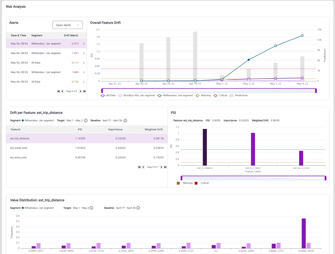
| Feature drift | Changes in the value distribution of a feature in a target window compared to the baseline window. For example, feature drift of Destination Locations this month comparing to the same month last year. |
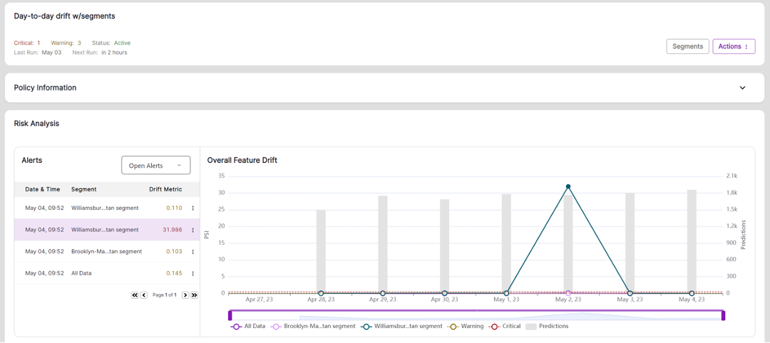
| Overall feature drift | Models have multiple features, and each feature is monitored independently for drift. Overall feature drift is the aggregation of drift from all features that are monitored in a policy. This represents overall drift at a policy level and is used to trigger alerts. |
| Prediction drift | Changes in the value distribution of predictions made by the model between the target window and baseline window. |
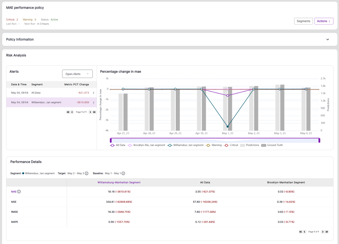
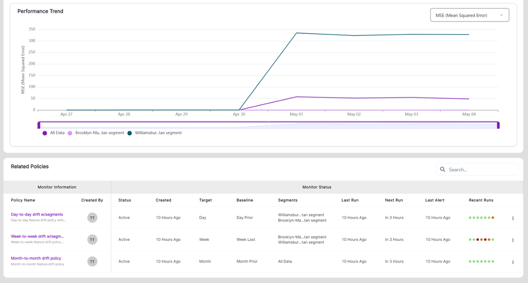
| Performance drift | Changes in the performance metric of a model over time. Performance metrics will be different based on model type. For example, for a regression model, performance metrics can be Mean Absolute Error (MAE), Mean Squared Error (MSE), or Root Mean Squared Error (RMSE). To better visualize data in the model dashboard, we use Negative MSE (NMSE) or Negative MAE (NMAE) on the model dashboard in this sample model. |
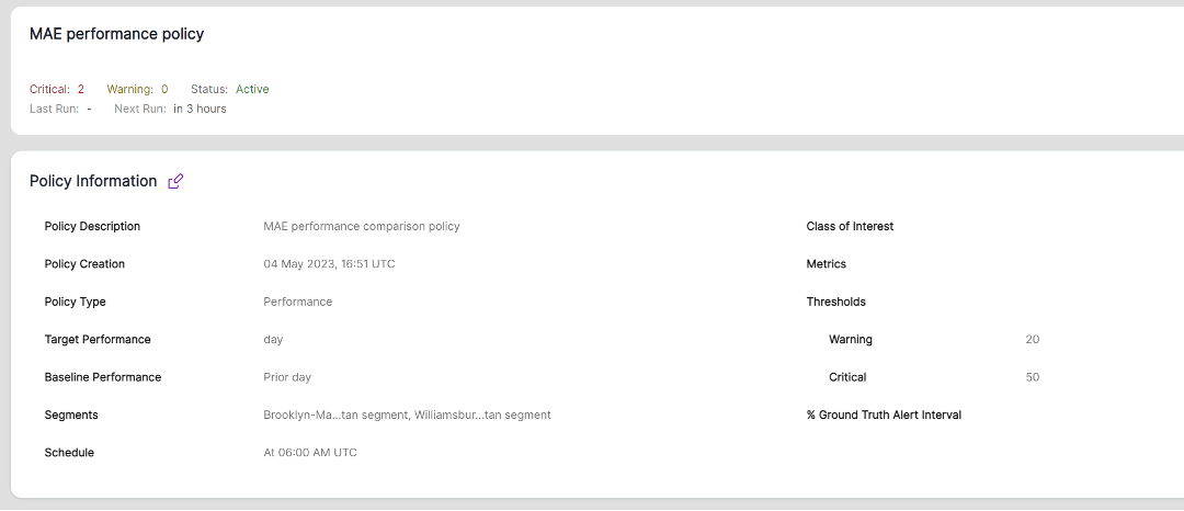
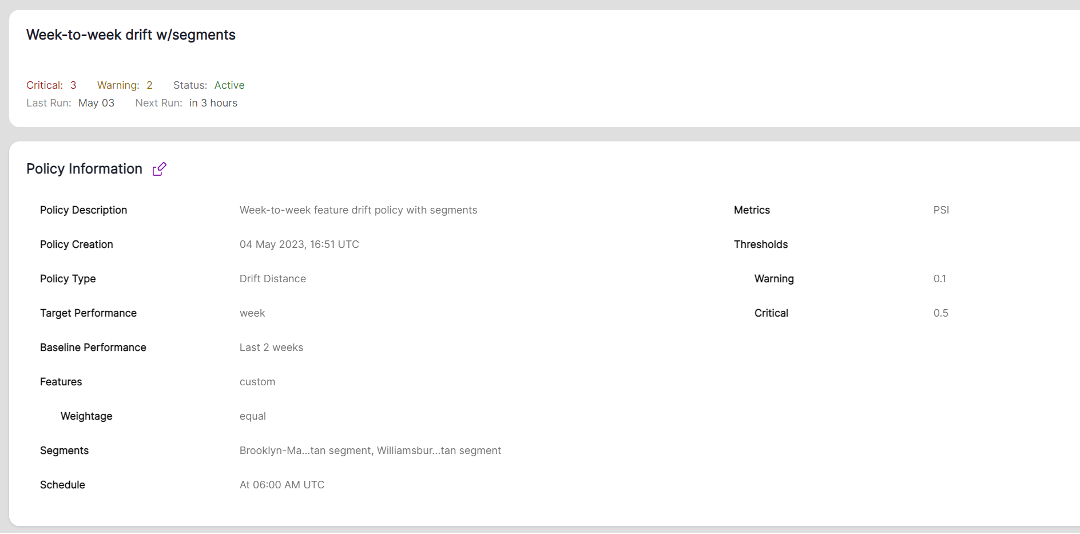
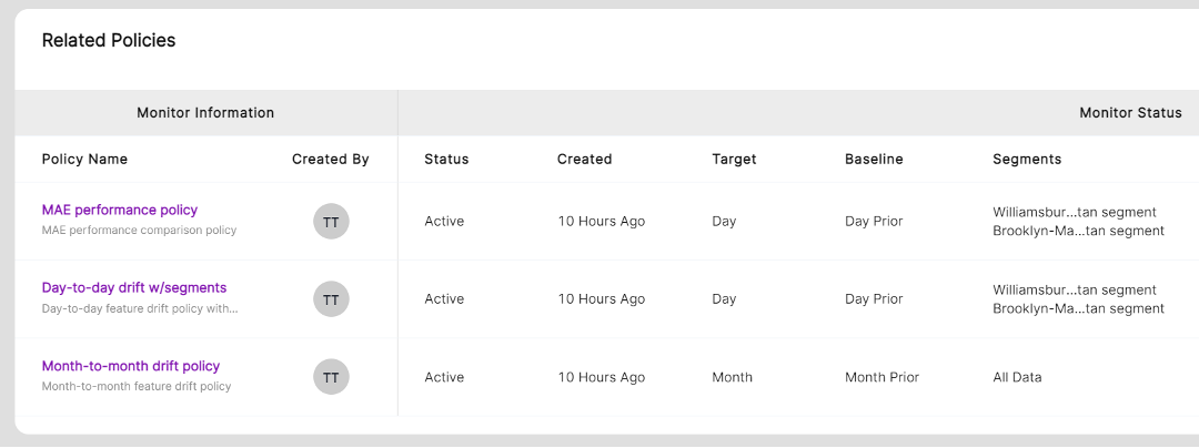
| Policy | Set of rules that define a process to monitor and alert users as drift happens. VIANOPS supports feature drift policy, prediction drift policy and performance drift policy at this release. You can define multiple drift polices with different settings to monitor models from different dimensions. These include target and baseline windows, drift metrics, alert thresholds, schedules to run policies, selected segments, and selected features. |
| Segment | A subsection of a data set used to narrow down the scope of focus and accelerate the ability to uncover patterns that may be occurring only in certain sections of the entire population but may have an impact on model behavior. For example, you can define a segment where destination location is ‘Manhattan’ or a segment where State is ‘CA’ and Age Group is ‘Senior.’ VIANOPS allows users to view and compare performance and drift across multiple segments at the same time. |
| Alert | An informational flag that drift has reached a pre-defined threshold in a policy. Alert levels include Critical (severe and need immediate attention) and Warning (less than critical but may need attention.). |
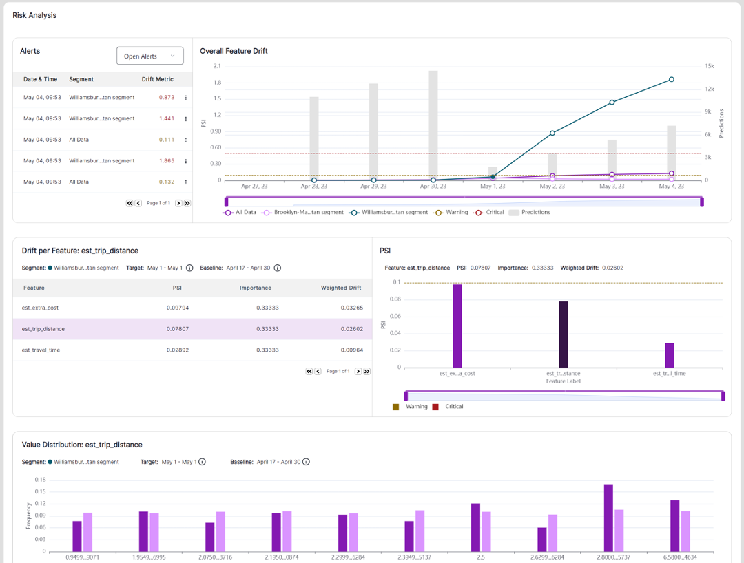
| Value distribution | The number of times a specific value fell into different bins (across a range of values) for a feature during a target or baseline window. For example, the estimated time for a taxicab ride may range from 5 minutes to 37 minutes for a specific target or baseline. VIANOPS allows users to customize how they view a range of values that is easy to understand in a business context. For example, instead standardizing the grouping of values (<5, 5-10, 10-15, and so on) users can create custom groups to better view and expose patterns, such as <5, 5-15, 15-45, 45-60, and >60 minutes. By default, VIANOPS groups the values into 10 bins for continuous features. For categorical features, the categories are the bins. |
| The data set | The NYC Taxi and Limousine Commission (TLC |
Part 2 – Exploring Model Dashboard and Investigating Performance Drop
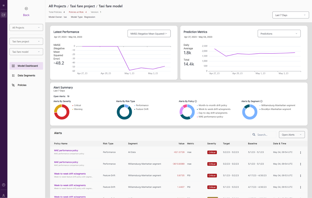
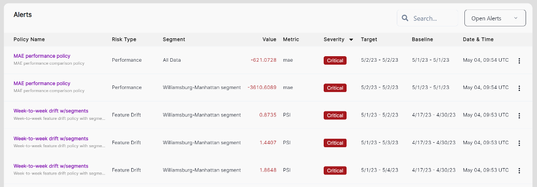
1. Launch the Model Dashboard of Taxi fare model where you can see a dashboard with different sections including Latest Performance, Prediction Metrics, Alert Summary, Alerts list, Policy list and Segment list.
2. Check out the Latest Performance on the upper left corner and notice the drop in performance that occurred a few days earlier.
3. Change the date range selector on upper right corner to Last 30 Days to check whether any performance drop occurred in the past month as well. Change back to Last 7 Days.
4. Explore the inference traffic in Prediction Metrics over time and note that the average daily traffic in the last 7 days is fairly consistent.
Performance and Prediction Metrics for steps 2-4

